A Surprising Source of Social Media Marketing Secrets

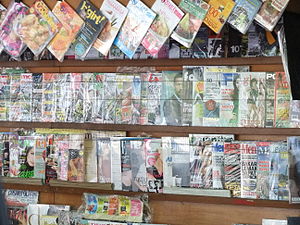
Indonesian magazines at a kiosk in Jakarta.

Image via Wikipedia

Magazines have been marketing themselves for over 100 years. In that time, they’ve learned lots of ways of interacting with readers.

Some insist that paper is obsolete, but those magazines and newspapers still have a few tricks up their saddle-stitched sleeves. The best part? You can adapt those tactics to the web and social media.

Here’s how it works.

Reader surveys

Magazines, especially women’s magazines love to include reader surveys. Readers write (or email now) in with answers to surveys about food, shopping, TV watching, all sorts of things. The readers are happy because they got to give an opinion (people love sharing opinions). The magazine editors get insights into what their readers want, will buy, and will read about. You can do this online too. Ask a question on your blog. Survey your email list. Then post the results.

Quizzes

Ask people to test their skills and knowledge. How much do you know about digital photography? Or Greek myths? Or Twitter? It’s fun – and it’s a super-sneaky “involvement device” – a way to get people to spend more time on your site.

Contests

Give something away. Everyone likes freebies. Offer a blog review to five random people. Encourage people to tweet, Facebook, and share your contest. In this case, online is even better – it’s easier to share and pass along than cutting out pages from a magazine.

Have you run a contest or quiz? How did it turn out? Do you think it’s a good idea?

Headlines

We’ve all gotten tired of deceptive “click bait’ headlines and “one weird trick,’ but magazines have been writing great headlines for years.  They know how to get your attention and persuade you to grab a copy and buy it. That’s not click bait, that’s good marketing. Use your headlines, subject lines, and post titles to engage emotions, prompt curiosity, and drive more opens and clicks.

How to Write Better Ads

writing with a fountain pen

Image via Wikipedia

In last week’s post about how to design an ad, I promised that I’d tackle how to write better ads.

The first thing you need to consider when writing ads is the headline. Some prefer to write it first, others last.  I tend to put in a placeholder headline and then go back to it later.  Sometimes, I just get a great idea straight off; other times I need some headline writing inspiration.  Whichever you do, spend more time on the headline than anything else.

Copy before design

Write the copy before you tackle (or hand off) the design.  It’s much easier to adjust copy to fit design (say too long for the space) than the other way around.  Get it as final as possible before the design stage.  If it’s going online keep it in plain text.  Microsoft Word makes an awful mess when you upload it to the Web.  And, never, ever use the text to HTML feature – that makes an even bigger mess.

Make a dummy

This is called a copywriter’s rough – it’s just a rough indication of where different elements should go (headline, illustration, etc).  Be sure to indicate where the headlines and subheads are so that the designer can emphasize them.

It’s not about you

Readers don’t give a fat rat’s fanny about you.  When you write your ad, focus on how you can help them with their problem (not how they can help you by buying).

Paint pictures when you write

Not literally, but with words.  Show them how your service or product solves that problem.  Use emotional triggers, then support the emotions with facts.

Prove it works

Write your ad with testimonials, demonstrations, or other social proof, like millions sold or thousands of subscribers.  People don’t want to be “sold,” but they do want to buy.  Make it easy for them to decide that your product will help them.

How to Design Ads That Get More Sales

In Confessions of an Advertising Man, David Ogilvy wrote, “Most copywriters think in terms of words, and devote little time to planning their illustrations. However, knowing how to design ads is just as important as knowing how to write them.

advertising

Image via Wikipedia

The illustration often occupies more space than the copy…it should telegraph the same promise that you make in  your headline” (for those under fifty, the telegraph was the 19th century’s version of instant messaging).

The way your ad looks is just as important as what it says (Yes, I know copywriters and designers clash about this. I’ve already written about marketing vs creatives. That doesn’t mean the words aren’t important too. Don’t worry, we’ll get to that in a later post).

Use photographs (not illustrations)

Photos draw more attention.   You want something that says clearly and immediately what your ad is about – something that tells a story.  Try before and after photos or an empty chair with a book nearby.  Or a dog gazing out the window.

Skip the pretty pictures

Avoid softly lit and carefully composed images. You don’t want award-winning, you want sales winning!

Make the logo bigger

I know it’s sacrilege, but it does work, especially if your clients and customers already know and trust you. It activates the “warm fuzzies” in their heads.

Try “direct marketing ugly”

This means starbursts, Courier or Times Roman type,   and minimal colors.  It often works better than something ‘pretty.”  Test it and see.  Some scoff at this, but it’s been working well since Claude Hopkins set down the principles of Scientific Advertising in 1920.

Add captions under the photo

People read them (more often than they read the article).

Use subheads – and bold them

Some people read everything, others scan.  Give the scanners enough to look at so they still get the story – and want to go back and read the bits they missed.

Keep your type at a readable size

11 or 12 points is best in print, make it 14 online.  Smaller than that and people can’t read it (if your audience is older err on the side of larger!).  In print, a serif font (like Times or Baskerville) is better.  Many prefer sans serif (like Arial) online, because the resolution of pixels on a monitor is harder to read than a printed page.

Light background, dark type

You can use black on white, dark blue on pale grey, or whatever colors appeal to your audience – just don’t reverse out (white type on dark background) large blocks of type.  It’s really hard to read.  You want people to keep going (not slow them down or frustrate them).

Break up the copy

Avoid one or two big blocks of  square text.  It’s pretty. but it’s harder to read and follow along.  Use bullets, arrows, and numbers to help readers follow along – and highlight the important stuff.  If it’s long copy, add some boldface subheads, block quotes or other eye-catchers to break it up.

Add leading

Leading is the space between lines (named after the actual lead that separated lines of type back in the days when it was set by hand with metal letters).  It’s easier to read the copy.

Oh, and these tips work online too.

The Biggest Mistake Advertisers Make

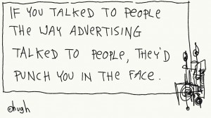
if you talked like advertising

If you’re like many advertisers, you think that all you have to do is put your ad in front of readers and the orders will pour in.  You love your product,  and you just know that your service is the greatest ever!

You think that if you just tell people about it, they’ll agree with  you.  Why, they’re just sitting at their desks waiting and hoping you’ll advertise to them.

No, not really.

There’s an ad for BMW on the New York Times web site today. The ad:

  • takes over the entire page
  • darkens everything else, except the ad video
  • prevents you from clicking on the content you came to read
  • is on a web site for a newspaper with a large readership in a city where most people don’t have or drive cars

It’s impersonal, irrelevant, and unwanted.  Nobody will want to watch your video, read your ad, or listen to your jingle unless there’s something in it for them.

Before you pay for that ad, create that video, or compose that jingle, think about what the customer gets.

Leave a comment and share examples of the biggest advertising mistakes you’ve ever seen.

Cartoon: Hugh MacLeod of Gaping Void

Whose Got Their Eyes on Your Ad?

eyes morgue file

As I mentioned last week, bigger, more annoying ads don’t work and neither do general banner ads. What does work is targeted, relevant ads, in the right place.

We’re programmed to think that more is better, and bigger is better. We want to go faster, not slow down. However, that may not be the best choice.

For example, say your company produces time and billing software for law firms. Let’s also suppose that your local cable company has a special promotion this month: 500,000 impressions (views) of your ad, on their front page, for only $500. Sounds like a great deal. Maybe it is, for a general advertiser, but not for lawyers who need time management software.

You may get a lot of visibility putting your ad on the Comcast home page in your town, but you won’t get the right people. What you do want is to specifically target lawyers, and the sites that they look at. So, you might try American Lawyer or the local bar association. Since these are places that lawyers frequent, your message is more likely to reach them (your target audience) than if you put it on the Comcast page.

Have stories of your own advertising successes (or mishaps)? Share them here.

Photo: clarita