What do Landing Pages Have in Common with Grade School?

classroom
Remember back in school when the teacher assigned homework on current events? First you had to find a story, then you had to play reporter. You always had to talk about WHO, WHAT, WHEN, WHERE, HOW, and WHY.

Well, landing pages are like that too. In case you’re not familiar with them, a landing page is a Web page set up as part of a promotional campaign. You develop them as a arrival point for different products and services based on keyword searches, email campaigns, TV, or even print.

What does this have to do with current events homework? The landing page has to follow a similar format.

WHO: Who are your customers (seniors, teenagers, business owners, moms, VPs of Marketing)?

WHAT: What are you selling, and what do you want people to do once they reach your page?

WHEN: Is the offer limited? Must they act now? Or is it “evergreen”?

WHERE: Where should visitors go on your page? Is it clear?

HOW: How do they respond or order? Click on a button? Call?

WHY: Why should people buy from you? What problem do they have? How do you solve it?

Focus on one thing only. Don’t try to sell four or five things on the same landing page. If you want to promote five products, make a separate page for each one. Make the call to action (click here, buy here) clear and big and obvious.

I saw a landing page for a summer camp recently that looked like a calendar. It listed several different sports (basketball, baseball, etc.) and the dates, but had no information on why anyone would want to send their child there. There were no clear buttons to sign-up or get more information.

The page had too much text and not enough pictures. If you operate a summer camp, have different pages for each sport. Show pictures of happy children playing. Paint a picture in words of the fun the children will have.

Organize the site for the buyer, not for yourself. Include separate menu bars for each audience. Use emotions, make them see the product. If you sell fruit, don’t say we have apples, pears, oranges, etc. Say, “these ripe, juicy Bartlett pears are so sweet and delicious you’ll need a napkin handy to wipe your chin.” See the difference?

Now go do your homework.


Do You Make These Six Web Site Mistakes?

Does your Web site invite visitors to linger? Or drive them away? The first few seconds are critical to making a good impression. Here are six common mistakes many business owners make (and how to fix them).

1) Graphic-heavy sites that take a long time to load. If it takes 20 seconds on a fast connection, it’s too slow. Amazon loads in a second or two. Rethink the size of your images, and in most cases, ditch the Flash intro.

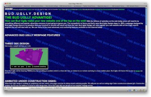
2) Light type on a dark background. I just saw this twice yesterday. It’s hard to read. Use contrast, and a light background with dark type for better legibility. Reading on a computer is harder than on a printed page. If you’re not sure what colors to  use, try color combos.

3) Fuzzy solutions to unclear problems. Be clear about who your customers are and what problem you solve. Talk about the pain they have (not yours) and what you’ll do to make it stop. One of the sites I looked at yesterday said was offering web hosting services. It said, “Want to build your Web site, we’ll do it for you.” It’s unclear who the customer is or what the benefits of using this company are. Is the site for people with technical know-how who want a reliable web host? Or, is it aimed at people who don’t know (or care) how to build a site and want someone to do it for them?

4) Asking for love, without trust. Would you ask someone to marry you after the first date? Or, as Chris Brogan vividly puts it, “put your tongue in the ear of someone who is trying to shake your hand?” Of course not. So, don’t put up big buttons asking people to follow you on Twitter, or spread your name to social bookmarking sites, unless and until you have gained their trust. Give them something worth spreading first. Be worth talking about. Then, and only then, have you earned the right to ask for something in return.

5) Unclear target customer. This same web hosting company offered bulk transfers, SSL certificates, and all sorts of complicated Web services. It was also promoting site building help and ease of use. One set of offerings seemed meant for beginners and people lacking Web expertise. The other set was targeted at network administrators with high-level technical skills. They were all lumped together and it was confusing. If you must sell to two such different customers separate the pitches. Have one page or menu button leading to information for beginners and another with information for experts.

6) Hard for new visitors to use. It may be obvious to you, but not your visitors. Have someone new try it. Watch them while they do it. See whether they can find what they want easily. Check what they read, and what they skip over. Darren Rowse has a First Time Reader Audit with more details (he’s talking about blogs, but the principles apply to Web sites too).

Photo: cogdogblog

Is Your Web Site Missing Vital Information?

information desk

Visitors to your site may arrive by keywords, searching specifically for your site, or trying to solve a problem. In addition to selling, offer useful information that will keep visitors coming back (and establish your company as an expert source of information and advice).

Add articles and how-tos

Offer tips on using your product. If you sell video games, give advice on getting past the angry gang at Level 14. If you sell dog food, have a section on why eggs are good for dogs.

An accounting software company could offer guides to running general ledger, accounts payable and other reports. AWeber (an email marketing campaign company) has an extensive knowledge base of tutorials, webinars, and videos covering every step of an email marketing campaign, from how to set up the initial message to creating forms to autoresponders (one or a series of emails sent automatically, such as an e-course).

Start a blog

This is also a chance to interact with prospects and customers. Showcase your expertise, and talk back (through comments and e-mail). It’s also good for search engine results (frequently updated copy gets Google’s attention).

I’m using WordPress for this blog; most hosting companies include it with their regular service, so you don’t even have to pay extra. Ask yours for more details on how to install it.

Write a white paper or report

Address a particularly vexing problem in your industry, or a point of pain for your customers. If you’re a computer expert write “10 Ways to Keep Your PC Safe From Viruses”. Offer it as a download and use it to build your contact list of potential prospects.

Produce a newsletter

Offer it to the people who download your white paper. It allows you to keep in contact with potential clients. Include information that’s useful. Don’t make it a hard sell. You want to keep your prospects engaged and interested (not turn them off).

After a few months, add back issues of your newsletter to your Web site (it offers fresh content, also liked by search engines, and offers a single place to find older issues (easier than searching through Outlook!).

Photo: maccath

Whose Got Their Eyes on Your Ad?

eyes morgue file

As I mentioned last week, bigger, more annoying ads don’t work and neither do general banner ads. What does work is targeted, relevant ads, in the right place.

We’re programmed to think that more is better, and bigger is better. We want to go faster, not slow down. However, that may not be the best choice.

For example, say your company produces time and billing software for law firms. Let’s also suppose that your local cable company has a special promotion this month: 500,000 impressions (views) of your ad, on their front page, for only $500. Sounds like a great deal. Maybe it is, for a general advertiser, but not for lawyers who need time management software.

You may get a lot of visibility putting your ad on the Comcast home page in your town, but you won’t get the right people. What you do want is to specifically target lawyers, and the sites that they look at. So, you might try American Lawyer or the local bar association. Since these are places that lawyers frequent, your message is more likely to reach them (your target audience) than if you put it on the Comcast page.

Have stories of your own advertising successes (or mishaps)? Share them here.

Photo: clarita

New Ads! Now, Even Bigger and More Annoying!

macys adThe Los Angeles Times reported (April 9, 2009) that the Online Publishers Association has just approved new extra-large Web ads. The association’s numbers show that web surfers are ignoring standard banner ads. So, in an effort to reach more people, they are launching three new larger ad formats: “pushdown” ads, which open to display a bigger ad; a”fixed panel” ads that appear to be part of the Web page, but scroll up and down as the user does; and XXL ads, which have pages that the user can turn.

Traditional advertising is designed to be repetitive, to “annoy” people, and to catch attention. The trouble (if you’re an advertiser) is that people are tuning out traditional advertising.

Looking at the LA Times site right now, there’s an ad for The University of Phoenix (an online university). I have a degree (from a brick and mortar school), so this ad is irrelevant to me. I won’t click on it, no matter how big it is, how much it flashes, or how many times I see it.

Bigger isn’t better. Relevant is better. What does work? Ads that appear when someone is already looking for something. Communications about something related to the content (such as a car ad next to a car review).

Blindly shooting and hoping to hit something won’t work.. no matter how big the ad.

What’s your marketing strategy? Are you targeting carefully? Or spraying and praying?

Photo: cogdogblog