What Your Clients Really Want


Magic wand

Magic wand (Photo credit: Wikipedia)

What’s your clients’ secret desire? What do they really want you to do for them?

If you could wave a magic wand and give them something, what would it be? Do you know?  Are you giving it to them?

They may say upfront that they want “a web site,” but what they really want is something that works, that they don’t have to fuss with, and that they can afford.  A designed from scratch standard web site for $300 is impractical, but a wordpress site with a pre-built theme might not be.  The template is fixed price, custom coding is extra.

Finding out what they want can make a big difference in how you present  yourself and how you approach prospects.

Do they want to learn how to get published?

Would they like to spend less time writing web copy and more time creating new recipes?

To compete against the “big guys” and win?

A set it and forget marketing system?

Share yours here. Or, write a post on your own blog about what your clients really, really want and how you help them get it. If you need help getting started, try this:

“I was reading a post on Fix Your Broken Marketing and Jodi challenged us to figure out our clients’ secret desires (for work stuff – hey get your minds out of the gutter!).  It was a little scary, but I thought I’d try it.  Deep breath… here I go”

(inspired by Naomi Dunford)


How to Safely Use Text and Photos You Find Online

© is the copyright symbol in a copyright notice

Image via Wikipedia

Plagiarize! Plagiarize! Let no one else’s work evade your eyes!

Sure it’s funny there, but not so funny when you really do it.  Or when someone comes after you because you stole their words or their photos.  Just because it’s online doesn’t mean it’s free.

Everything is automatically copyright (and belongs to the person who created it), even if they don’t specifically say so.

There are some exceptions.

Public domain works

Copyright lasts 70 years.  After that, it’s in the public domain (unless it’s renewed).  You can use anything you like of Shakespeare’s, take your own pictures of the Acropolis (the builder can’t sue you), and photos that are in the public domain.

Creative Commons

Sometimes called “copy-left”, creative commons lets you create different degrees of copyright.  Some are free to use if you attribute the creator.  Others must be non-commercial (though it’s a bit unclear what commercial means – don’t use the image to illustrate a blog?  don’t sell the image as a poster?).  Another license lets you use the words or photos under a share and share alike license.  This means you can use it, but whatever you use it for is also share alike (like Wikipedia). There are also lots of sources for free, legal photos.

Permission

You have permission.  Sometimes, just asking will get you an OK to use something. If you want to use something of mine, just ask.

Fair use

This is a little tricky, but it essentially means that news organizations writing a story about McDonald’s can use a picture of the McDonald’s logo to illustrate their story.  Or, a comedy show can use it as part of a spoof.  You can also quote small portions of a copyrighted work (with attribution). If you’re going to sell something with the quote in it, you might want to get permission (like using a poem in your novel).

Note, I am not a lawyer.  These are just general guidelines to keep you out of trouble.

Can you identify the quote at the top? Bonus points if you do.

Free Web Color Schemes

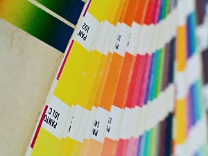
Colors by Pantone

Image via Wikipedia

In the days of print-only, more colors meant more money. There were no free color scheme tools readily available, and mistakes could be costly.

Choosing a color scheme could be intimidating and mistakes were costly.  If you’re not a graphic designer, you may not have a color wheel in your head, or the knowledge to know when it’s OK to “break the rules.”

I remember struggling mightily to use percentages of some Pantone shade (10% or 40% or similar) to make it look as if there were more “colors” on the page. Now, on the web, it doesn’t really matter how many colors you use. Just do use them (if everything is all one color it’s tough to read).

But how do you know which colors to choose? Luckily, there are plenty of places online that can help.

Free color scheme tools

If you’re not sure which colors look well together, here are some tools that will help.
Paletton  This tool works differently from most online color schemes.  It’s based on the classic color wheel.  You can select monochromatic (one color in different shades, for better contrast), three adjacent colors, three contrasting colors, or four-color combinations. Click on one of the dots on the wheel to change its color (hue on the wheel) or to move the different colors (dots) closer together or further apart.  Based on your choices, the box on the right will change so you can see how your colors look together. The web color shows up in a little box under the wheel.

Color Hunter Color hunter allows you to create color schemes from existing images.  You can use one of the images on their site, select an image from a website, or upload your own. The site then breaks down the images into color chips, with the  web color hex number listed underneath and the original image on the right.

ColorSchemer – Online Color Scheme Generator If you already have a color you want to use (say a logo image or a company brand color), but need to know what goes with it, try this color generator. Type in the RGB or hex number into the little boxes on the left.  The right side will show a series of sixteen color chips that complement your initial color. You can then lighten or darken the overall color scheme.  I wouldn’t use all sixteen colors in one site though. Stick with three or four.

ColorCombos.com – Combo Library – Web Color Combinations Library Combo library has several different ways to choose a color scheme.  You can search for colors by common names (such as aqua, baby blue, or brown).  Or, you can start with a hex code. It also has pre-made combinations (so you can just pick one that’s already there).  If that doesn’t work for you, try one of the popular colors (along the side).  Finally, you can find an existing site you already like, plug in the URL and find out what the colors are.

Material Design Pick any two colors you like.  Click on them.  A full palette of eight colors that work together will show up on the right of your screen. The colors are marked with their hex colors and the palette has instructions on how to use each color on your site. For example, dark blue as a primary color, yellow as an accent, black as text, and so on.

Coolors.co It doesn’t get any simpler than this.  There’s a changing display of color schemes right on the web site.  Hit your space bar to pick one. Click the “get started” button and you’ll see a range of colors. Click on a color you like (to lock it in) and press the spacebar. Poof, a new palette, with the hex numbers listed. You can also use an existing image.


Hardware, Frames, and the Curse of Knowledge

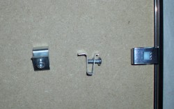
frame hardwareEver hear of “the curse of knowledge”? It’s the idea that knowing something well can sometimes be a problem (rather than a benefit).  When you know the thinking about a particular web design or how a chair should be put together (I’m looking at you, Ikea), it seems easy and obvious.  The trouble is those without your inside information may find themselves completely stumped.

For example, the photo on the right is the hardware that came with my new picture frame. I figured out the clips (the piece stuck in the frame on the far right) pretty quickly, but was stumped about the v-shaped hardware.

It looked like the clips were there to help hang the frame it on the wall, but I couldn’t figure out how they were meant to work. The best I could figure was that the V-shaped piece should slide in somehow, but it didn’t hold when I tried it. Since I am a writer, rather than an engineer, I sent a photo to my brother (who is an engineer). He was stumped too.

Tech support

Then, I called “tech support” at A.I. Friedman (the art supply store where it came from). I left a message, but wasn’t sure if anyone would get back to me (they did, later). Since I really wanted to hang that poster, I decided to take it down to the hardware store around the corner. If he had no clue, there was a framing place next door. One of them should be able to help me.

Hardware to the rescue

The hardware guy figured it out. I’d had the right idea. You had to loosen the screw first, then slide the V-shaped piece in, then insert the picture wire and voila!

It’s too hard

It took three smart people an hour or so to figure this out. There’s a parallel to web sites and marketing too. A simple piece of paper with an illustration and instructions would have solved the problem. Maybe the solution was obvious to the manufacturer, but it wasn’t to me or to an engineer.

I remember seeing an example of a web designer who changed their site every week! All the examples were beautiful, but imagine trying to use that site regularly?  The colors kept changing, the menus moved around; it was impossible to find anything.

Don’t confuse people

Now, take a look at your own website or other marketing materials.  Are they easy to use?  What’s the bounce rate on your key pages?  Are people coming to your site and then leaving because they can’t figure out what to do?

Or, do you have too many options? When people are overwhelmed with options, they are likely to leave your site, without buying anything.

Check the simple things too.  Is it easy to contact you, and is it easy to find that information?  Is there a pop-up or a Flash presentation that covers the content?  Can they be closed easily, and is the method obvious?

If you’re not sure, ask some of your current customers or clients.  Or, try showing your site to someone else, who doesn’t work for you.  Can they navigate it?  Or do they need to call “tech support?”

What do you think about this?

I saw this video on Web Ink Now today. It was part of a post pointing out that people don’t care about your products (as a business), they care about their problems and whether you can help fix those problems. So far, so good and I nodded my head in agreement.

Then he included a video. He said it “offers a twisted look at the problem with older TVs. The link at the end of the video points to a webcast with Cisco chairman John Chambers, during CES on Jan 5.”

Here’s the video:

https://www.youtube.com/watch?v=fMsY9O9iLqk

I completely agree that saying your product is great or talking about the 1080p definition or the thousands of connections doesn’t help.

I don’t like the video video though. It seemed to make fun of older TVs (or people who had them), rather than helping them.

And the link to the talk at the end (which, I confess I didn’t watch) isn’t terribly clear. If David hadn’t pointed it out, I would have never known what it was.

Clever is fine – but not for the sake of being clever, which this seems to be.

What do you think?