Tuesday Travels: Just for Web Designers


Web design on a Boston Cream, er, Boston Scream.

Web design (Photo credit: Wikipedia)

HTML 5 Facts and Myths -there’s a lot of talk about HTML 5 and how it kills Flash, won’t be ready for years, etc. How much of that is true?

HTML 5 Tutorials – links to 40 tutorials, including how to use Canvas, building apps, creating forms, and how to make it play nicely with IE6 (shudder).

20 Tools for Creating Responsive Web Designs – sketching and wireframing tools, grid calculators, and tools for responsive images, videos, and tables.

Responsive Web Testing Tools – now that you’ve got all that beautiful design, you’ll need to test it to make sure it works properly.

Responsive web design missing the point – there’s a lot of hoopla in web design circles about this — but does it really matter?

Tuesday Travels: Web Design Templates and Tools

Lower case ‘a’ from Adobe Caslon Pro, superpos...

Image via Wikipedia

Web design inspiration to get your brain humming with ideas

Catalog of free open-source fonts why stick with the same old boring fonts (or old web limits), when you can have fun?

Typography calculator – so you know what line height to use between your paragraphs (you know, leading, back in the day). Enter your type size, and the width of the page, and get suggestions. It will even display the results in the appropriate font face.

Inexpensive or free wordpress themes. These are modern, and minimalist designs. The site comes up in German, but there’s an English option.

Is This Common Website Design Mistake Driving People Away from Your Website?

LED throwies chaosThere’s a marketing guru whose blog I used to read quite often.  I like his posts, but I can’t stand to read them any longer. His website design is driving people away.

His content is great, but he’s got a thing for bright, shiny toys – and kept adding more and more widgets, ads, and popups – to the point where I couldn’t read his blog any longer.  It gave me a headache.  I did keep my subscription to his newsletter though (because that stood still).

Well, today I clicked on a link back to his site – and voila! he’s fixed it.  Still some blinking and moving, but much, much better. So now I can read his blog again.

Does your website do the same?  Are you driving people away with your addiction to “shiny toy syndrome”?

It doesn’t matter how great your content is, or how skilled you are, if the visitors to your site can’t use it.

Videos, popovers, popunders, hello bars, and subscription requests can all be useful and helpful additions to a website.  But not when they overwhelm your visitors. Or worse, when the video plays automatically, the popover covers the page, or readers have to fight their way through a thicket of ads/popups/subscription requests, and videos just to read the first words on the page.

I just looked at another site that greeted me with a popup (asking me to subscribe to their blog.  That was layered on top of another popup for an ebook.  There was another subscription request (for the same ebook) in the right sidebar.  Plus, a long list of sharing icons on the left.

I haven’t read one word of the article yet, and already they want me to make a long-term commitment. Nope.

Take a step back. Think about the user experience.  Then cut back on some of those blinky flashy lights and shiny new toys.

Your readers will thank you.


Free Web Color Schemes

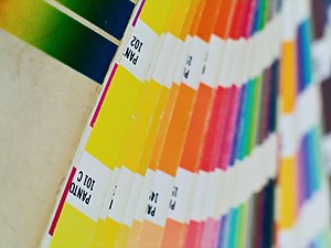
Colors by Pantone

Image via Wikipedia

In the days of print-only, more colors meant more money. There were no free color scheme tools readily available, and mistakes could be costly.

Choosing a color scheme could be intimidating and mistakes were costly.  If you’re not a graphic designer, you may not have a color wheel in your head, or the knowledge to know when it’s OK to “break the rules.”

I remember struggling mightily to use percentages of some Pantone shade (10% or 40% or similar) to make it look as if there were more “colors” on the page. Now, on the web, it doesn’t really matter how many colors you use. Just do use them (if everything is all one color it’s tough to read).

But how do you know which colors to choose? Luckily, there are plenty of places online that can help.

Free color scheme tools

If you’re not sure which colors look well together, here are some tools that will help.
Paletton  This tool works differently from most online color schemes.  It’s based on the classic color wheel.  You can select monochromatic (one color in different shades, for better contrast), three adjacent colors, three contrasting colors, or four-color combinations. Click on one of the dots on the wheel to change its color (hue on the wheel) or to move the different colors (dots) closer together or further apart.  Based on your choices, the box on the right will change so you can see how your colors look together. The web color shows up in a little box under the wheel.

Color Hunter Color hunter allows you to create color schemes from existing images.  You can use one of the images on their site, select an image from a website, or upload your own. The site then breaks down the images into color chips, with the  web color hex number listed underneath and the original image on the right.

ColorSchemer – Online Color Scheme Generator If you already have a color you want to use (say a logo image or a company brand color), but need to know what goes with it, try this color generator. Type in the RGB or hex number into the little boxes on the left.  The right side will show a series of sixteen color chips that complement your initial color. You can then lighten or darken the overall color scheme.  I wouldn’t use all sixteen colors in one site though. Stick with three or four.

ColorCombos.com – Combo Library – Web Color Combinations Library Combo library has several different ways to choose a color scheme.  You can search for colors by common names (such as aqua, baby blue, or brown).  Or, you can start with a hex code. It also has pre-made combinations (so you can just pick one that’s already there).  If that doesn’t work for you, try one of the popular colors (along the side).  Finally, you can find an existing site you already like, plug in the URL and find out what the colors are.

Material Design Pick any two colors you like.  Click on them.  A full palette of eight colors that work together will show up on the right of your screen. The colors are marked with their hex colors and the palette has instructions on how to use each color on your site. For example, dark blue as a primary color, yellow as an accent, black as text, and so on.

Coolors.co It doesn’t get any simpler than this.  There’s a changing display of color schemes right on the web site.  Hit your space bar to pick one. Click the “get started” button and you’ll see a range of colors. Click on a color you like (to lock it in) and press the spacebar. Poof, a new palette, with the hex numbers listed. You can also use an existing image.


Web Design Decisions: Personal Taste or Market Importance?

Commemorative coffee mug from the festival, sh...

Image via Wikipedia

Ever wonder how people can stand cheap design? Do you get mad when you see crappy logos, blinking/flashing ads, or weird web design decisions?

Someone on a forum got annoyed recently (I’m changing details) about crappy mugs (he sells nice ones).

How can people use those? I see them in offices or on TV and I want to scream!

He’s confusing personal with important.

Fine quality is important to him. It may not be important to other people. Why use cheap mugs (or cheap designers or cheap writers)?

1) They don’t know any better
2) They know and don’t care
3) Focused mostly on budget
4) Prefer to spend money elsewhere – such as fine tea or coffee to go in those mugs

Creatives vs. marketing (or non-creatives)

You (or I) may think sites such as 99Designs and odesk are a travesty. That doesn’t mean everyone does. And that market may not be best for you anyway. Ignore them. Go find clients who do care. Then convince them you’re a better alternative. Tell them why it’s better for them. Focus on the benefits they will get from a trained designer, not the benefit you get because they hired you.

I personally don’t care about the Liverpool Garden Festival, but somebody else cared enough to make this mug and successfully sell it.

“Personal’s not the same thing as important. People just think it is.” – Esme Weatherwax (bonus points if you get the reference).