4 Simple Steps to Great Marketing

The AIDA marketing model is a simple four-step marketing strategy has been around since Claude Hopkins, nearly a century ago.

It’s got more identities than Batman.

Some call it A-I-D-A (Attention, Interest, Desire, Action). Others say it’s the 4 Ps (Promise, Picture, Proof, Push).

Old-fashioned?  Maybe.  But even at a century old, it still works.

Here’s how.

Attention or promise

The first step is the big idea.  It’s the headline.  The one that has to make anyone who sees or hears it stop and look. Here’s where you tell readers what you can do for them, and why they want it. The box, the book, the solution to the problem that’s got your prospects staying up late at night. Use the headline to engage their emotions, stir their curiosity, or ignite their greed. The headline has to do most of the work, so make it a good one.

Interest or picture

Now we’re telling people more about what they’ll get. This section builds on the headline to paint a mental picture.  We’re getting into more details about results.  We’re telling readers how much better they’ll feel. The money they’ll earn. The peace of mind they’ll have because their cars will run better. Showing them the instantly recognizable logo that will make the competition look shabby and cheap.

Desire or proof

Show your readers why they want your product.  Go into more details about what it does, the problems they will solve, the information they’ll get, and how it will improve their lives or their businesses.  Give them proof that it works. Include your own results, or even better, testimonials from other people. Cite statistics showing why your solution is better than the alternatives or showing the increase in sales, loss of weight, etc. users have experienced.

If you have a guarantee, include it here.  This proves you stand behind your products and services and increases your credibility and trustworthiness.  It also reduces the risk of buying.

Action or push

Last (but never least) the call to action. This is where you tell people to go do something. Explain  how to get the product and exactly what steps they have to go through. Describe what will happen next (emails they will receive, waiting time, and so on.  If it’s a limited offer, say so here (it adds urgency).

Get More Sales by Offering a Refund

money back icon

Image by 1stlogodesign

Ever see a big guarantee on a web site?

You’re happy, or your money back.

Risk-free trial. Try it for 30 days, if you’re not happy, we’ll refund your money.

Here’s one from Bob Bly:

“Best of all, Cheap Car Tips and Tricks comes with our iron-clad money-back guarantee. If you are not 100% satisfied with the guide, just let us know within 90 days for a full and prompt refund.That way, you risk nothing. So what are you waiting for? To order Cheap Car Tips and Tricks, just click below now.”

Here’s mine:

The backwards and forwards guarantee

“I’m stealing this idea from Megan Elizabeth Morris, who stole it from Naomi Dunford (who stole it from Mark Silver at Heart of Business). Here’s how it works. Buy the checklist. If you decide you don’t find it useful, I’ll refund your money. All you have to do is ask— and forward the website review checklist to someone you think can use it. Let me know why, and I’ll improve it for the next version or suggest other people or resources that may help.”

How a money back guarantee increases sales

Is a guarantee required? No. However, it’s a good thing to do. Why? Because it shows you have faith in your product. And, it reassures people that if they have a problem, you’ll stand behind what you do.

This is called risk reversal. It transfers the risk of buying from the purchaser to the seller. This doesn’t just make you look good; it will get you more sales because it makes you look more reliable and trustworthy.

A creative guarantee is even better. It stands out in the reader’s mind.

Longer guarantees are better than short ones. So is a guarantee that lets you keep the bonus “all about widgets podcast,” even if you return the widget buying CD that you ordered.

Try it. I guarantee you’ll like it. 😉

Real Estate Marketing Mistakes

Know how they run those ads before the movies? The ones for local businesses? Haircuts, casual restaurants, real estate agents and so on?

Given half a chance, most people seem to ignore those ads in favor of keeping their noses in their phones, or munching on popcorn and snacks.

Captive audience, bad message

There was one the other day that stuck in my head, but for the wrong reasons. It promised XYZ Real Estate was a “cutting edge” company, a leader in real estate since _____ with innovative solutions.

I’m not in the market for a house (don’t have the $4,000,000 it takes to buy one around here), but if I were, this company would not be at the top of my list.

They’re trying to build themselves up, rather than tell me how they can help me.

No differentiation. No niche. And no message that matters to a client. They’ve spent a lot of money on a marketing mistake that likely won’t get them many sales (or even phone calls inquiring about their services).

A better marketing idea

Why not skip the useless gobbledygook and offer something that does matter.

For instance, how about help getting a loan. Or a list of 10 things I need to know before I buy a house. That wouldn’t fit in a movie ad, but a phone number to call would.

Or, what about an offer of relocation assistance (what’s in my new neighborhood, getting kids enrolled in school, local grocery stores). Another tactic could be specializing in townhouses or condos or large families needing a home (space is at a premium in New York).

Any of these strategies would have made this real estate agent really stand out. And get more clients too.

What do you think?

Do you pay any attention to those ads? Do you like them? Hate them? Do you want some popcorn? 😉

Lamborghini or Hyundai? 99Designs vs Designers

lamborghiniA-list blogger and successful social media consultant Chris Brogan posted a logo design project on 99Designs a few days ago. Then, he tweeted about it.

All hell broke loose.

If you don’t know, 99Designs is a design contest site. Businesses post a project, with a budget, and entrants submit work. If they win, they get paid. If not, they worked for free.

The small business reaction to 99Designs

Judging from the comments, small businesses love it. It’s cheap! It’s fast! There are lots of options! They think, “Hey I can get something that looks nice and I don’t need a second mortgage on my house!”

99Designs vs Designers

Experienced designers hate it. It’s spec work! It devalues my art! It looks like crap! Would you ask 50 contractors to build a new den on spec?  Or trust your operation to an amateur brain surgeon?  What about the story of your company? Or how the colors and fonts express your philosophy?

They insist that you can’t just get a logo in one format. You need different versions for larger/smaller or print/web uses.

All true.

However, railing and ranting (while immediately satisfying) won’t change anything.

How to charge more for your work

If you want to get higher prices for your work, you need to better communicate and to better educate your clients:

  • why you are worth
  • who your market is (and isn’t)
  • why buy from you
  • what  you offer that cheap designers can’t (in business terms)

Specialize – pick a specific market (a niche, more on this coming later). Focus on them. Ignore everyone else.

Brand – use some of those branding skills on yourself. Are you the Ferrari of designers? Or the Smart Car? Why do people choose you? What do you bring to the job that other designers (or that cheap designers) don’t have? How are you remarkable?

Extra value – why knowing the difference between EPS and and RGB matters. And why one logo format doesn’t work for all media (web, trade show banners, brochures, faxes). A logo that looks OK online might look like a mud pie printed out in black and white.

Copyright /Due Diligence – a designer logo is the client’s alone – not ripped off from someone else’s site or work (legal fights are scary and expensive).

Skip the “I’m a professional, I have years of experience.” You are, and you do. That’s not what matters to the client. What matters to the client is whether you give her what she wants – to feel better, look better, earn more, be more successful.  What are you really selling?

Here’s the thing. Lamborghini doesn’t really sell cars. They sell status, luxury, sex appeal, and VROOOOM.

Hyundai sells cheap, reliable, and super guarantee.

Are you Lamborghini or Hyundai? Does Hyundai care about Lamborghini’s buyers? No. Nor vice versa. They ignore each other.

Show them why a real designer is worth it. And try to understand when they want to make the logo bigger!

Share your thoughts

What do you think about this debate?   Does cheap or spec  work hurt designers?  Does it matter what the “cheap” people do? What other ways can you approach the problem?

Image thanks to omniNate

10 Ebook Design Tips for Non-Designers

Want to make an ebook?  They can be a great way to spread the word about your expertise (remember offer something valuable, not a sales pitch), or to earn some extra money by selling your expertise to many people at once, rather than one at a time.  However, if you’re not a designer, it can be hard to make your creation look good.  I learned these the hard way. I share these ebook design tips for non-designers here to save you some grief (and lots of hair pulling).

1. Don’t design your ebook in Word

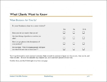
That’s what I did (big mistake). Now, it looks good (considering):

However, it was ridiculously hard to do. It’s like using a hammer to stir soup. Good tool, but not the right one for the job.

2. Word breaks your pretty links when you save to pdf on a Mac

By pretty links, I mean the ones that looked like “mysitepage”, instead of the ones that were written out http://www.mysitepage.com. ARGGHH!! It seems Mac Word and pdf files don’t play well together.

(Thank goodness for Tom Bentley, who rode to my rescue to fix it).

3. Use Pages (for Macs) or get InDesign

You’ll sleep better, and you’ll keep more of your hair.  Unlike Word, these are spoons (not hammers). They are designed for creating books, letterhead, and brochures.  Pages comes with templates which  you can use straight out of the box or modify.

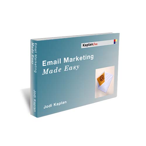
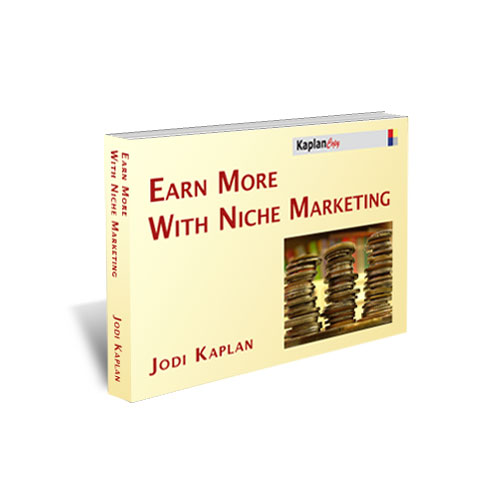
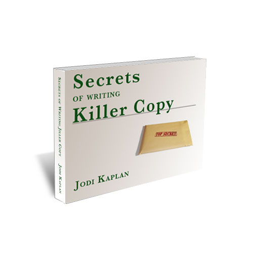
4. 3-D covers look more real and substantial

email ebook niche marketing ebook  copywriting ebook


I have three free ebooks on this site for download: Email Marketing Made Easy and Secrets of Writing Killer Copy. I created them myself with a tutorial. It’s doable, but it took me a long time. If you would rather concentrate on other things, hire a professional. Check my list of resources for some recommendations.

4. Make it horizontal (landscape), instead of vertical (portrait)

Most people will read it online or on a computer. Monitors are sideways rectangles.

2016 Update: The rise of mobile reading and browsing has changed this. Smartphone and tablet usage is growing, while desktop is declining.  Keep it vertical.

5. Start new chapters on a fresh page

It looks cleaner, and it’s easier to read. Break up the text into small chunks (like I’m doing here). Big blocks of text are harder to read on a screen.

6. Use different fonts (and colors)

One font and color for chapter headings and headlines. Another for body text.  You can use another for callouts if you want.  Not too many, maybe two or three tops. You don’t want it to look like a ransom note.

Also, check to see how it looks on other computers/monitors/operating systems.  One of my original choices (Big Caslon), came out looking like a Star Trek font on a Windows machine.

7. Use pictures

You can find interesting images for free online.  Here are some places to get free images.  Make sure they have the right creative commons (for commercial use with attribution), and not a share-alike license. Otherwise, you may make your work shareable (and sellable) by other people.

8. Buy a design book

Get a copy of Designing for Non-Designers by Robin Williams (no, not that Robin Williams). Very helpful, as is her Looking Good in Print.

9. Hire a pro

Did I mention that already? Gack!

Send him or her the copy in plain text, or with as little formatting as possible.

If you want something to be a headline or a table, make a note in the text. Or, add instructions saying headlines in bold, tables in blue, or whatever.

10. Get extra sets of eyes

Have other people look at it before you ship.  They’ll catch dumb mistakes you missed.

It’s also a good way to find out if you’ve gotten your points across clearly, or if you’ve used abbreviations or jargon that your audience doesn’t understand.