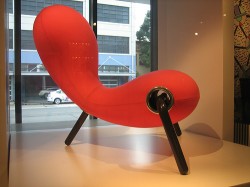
Photo thanks to: sheilaellen
Have you ever been to a designer showcase? If you haven’t, here’s what happens.
An organization takes an empty house and recruits interior decorators to fix up each room. They raise money, often for a charity, by charging admission. As a result, the designers get publicity, and the public gets design ideas and entertainment. All great.
The trouble is that those rooms are often unusable. The sinks are at one end of the kitchen and the stove is at the other. The forks won’t pick up food. You can’t sit in the chairs, and the bathrooms are all-white (ha)!
Great design isn’t enough
The same sort of design mistakes can happen with web sites. You know, the kind that gets featured in a Smashing Magazine web texture showcase. They’ve got clever widgets, jaw-dropping graphics, beautiful colors, even designs that change every day!
They’re amazing. Some of them are unusable.
Beautiful is great. So is award-winning. Neither one necessarily makes money.
Great design, or even OK design, won’t sell all by itself. Good design makes your site easier to read, easier to use, and facilitates the actual buying process. A site that’s hard to read, and hard to use, can’t sell anything.
Design has to be functional, not just pretty
What the design should do is:
- Reflect your company’s personality and industry; a crayon-colored design would look out of place on a law firm’s web site
- Be easy to use; the design should guide visitors to finding whatever information they are looking for, whether it’s marketing tips, contact information, or how-tos.
- Establish your credibility (that crayon-colored site wouldn’t reflect well on a law firm)
- Build trust that you are an expert in your field, and can provide solutions to visitors’ problems.
- The colors, typefaces, testimonials, and the copy should all reflect your understanding of your audience, what you do, and why you are worth the money you charge to do it.
Amazon’s site isn’t beautiful. It’s very functional though. Apple’s site is beautiful, but the design is unobtrusive.
Yes, have design that serves the function of the web site – but don’t let the design overwhelm everything else. Design doesn’t sell by itself.
Design your site for other people
Don’t make decisions based solely on what you like (unless you’re darn sure you match your “tribe”). I’m not saying you should hate your web site, just that you’ll do better if you keep your visitors’ preferences in mind. Don’t make your site purple because you love purple.
Paint mental pictures
Write content that talks to your readers and about your readers. When you do want people to buy, they should be able to see, taste, and smell how great they’ll feel if they buy from you.
Here’s a simple example from online grocer FreshDirect (I don’t know who writes their copy, but he or she is good!):
hint of cloves and tart pineapple. Juicy as a honeydew. This all-purpose pear holds up well when cooked, but it’s just as good right off the tree.
That’s for a pear. Are you hungry?
