Want to make an ebook? They can be a great way to spread the word about your expertise (remember offer something valuable, not a sales pitch), or to earn some extra money by selling your expertise to many people at once, rather than one at a time. However, if you’re not a designer, it can be hard to make your creation look good. I learned these the hard way. I share these ebook design tips for non-designers here to save you some grief (and lots of hair pulling).
1. Don’t design your ebook in Word
That’s what I did (big mistake). Now, it looks good (considering):

However, it was ridiculously hard to do. It’s like using a hammer to stir soup. Good tool, but not the right one for the job.
2. Word breaks your pretty links when you save to pdf on a Mac
By pretty links, I mean the ones that looked like “mysitepage”, instead of the ones that were written out http://www.mysitepage.com. ARGGHH!! It seems Mac Word and pdf files don’t play well together.
(Thank goodness for Tom Bentley, who rode to my rescue to fix it).
3. Use Pages (for Macs) or get InDesign
You’ll sleep better, and you’ll keep more of your hair. Unlike Word, these are spoons (not hammers). They are designed for creating books, letterhead, and brochures. Pages comes with templates which you can use straight out of the box or modify.
4. 3-D covers look more real and substantial
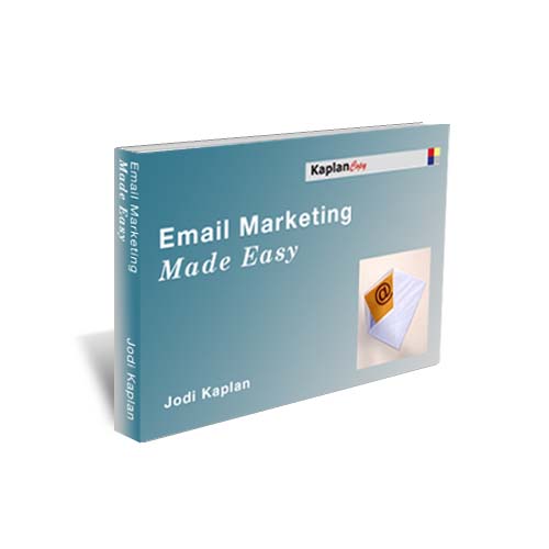

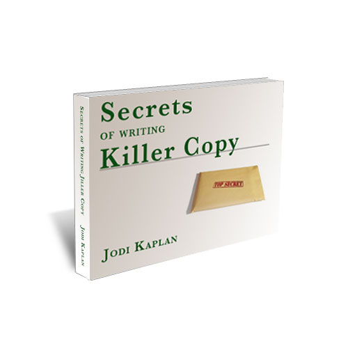
I have three free ebooks on this site for download: Email Marketing Made Easy and Secrets of Writing Killer Copy. I created them myself with a tutorial. It’s doable, but it took me a long time. If you would rather concentrate on other things, hire a professional. Check my list of resources for some recommendations.
4. Make it horizontal (landscape), instead of vertical (portrait)
Most people will read it online or on a computer. Monitors are sideways rectangles.
2016 Update: The rise of mobile reading and browsing has changed this. Smartphone and tablet usage is growing, while desktop is declining. Keep it vertical.
5. Start new chapters on a fresh page
It looks cleaner, and it’s easier to read. Break up the text into small chunks (like I’m doing here). Big blocks of text are harder to read on a screen.
6. Use different fonts (and colors)
One font and color for chapter headings and headlines. Another for body text. You can use another for callouts if you want. Not too many, maybe two or three tops. You don’t want it to look like a ransom note.
Also, check to see how it looks on other computers/monitors/operating systems. One of my original choices (Big Caslon), came out looking like a Star Trek font on a Windows machine.
7. Use pictures
You can find interesting images for free online. Here are some places to get free images. Make sure they have the right creative commons (for commercial use with attribution), and not a share-alike license. Otherwise, you may make your work shareable (and sellable) by other people.
8. Buy a design book
Get a copy of Designing for Non-Designers by Robin Williams (no, not that Robin Williams). Very helpful, as is her Looking Good in Print.
9. Hire a pro
Did I mention that already? Gack!
Send him or her the copy in plain text, or with as little formatting as possible.
If you want something to be a headline or a table, make a note in the text. Or, add instructions saying headlines in bold, tables in blue, or whatever.
10. Get extra sets of eyes
Have other people look at it before you ship. They’ll catch dumb mistakes you missed.
It’s also a good way to find out if you’ve gotten your points across clearly, or if you’ve used abbreviations or jargon that your audience doesn’t understand.
Gack! Nice list, Jodi!