Is this a great new marketing tool?

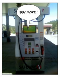
supermarket gas pump

A friend in Colorado (where apparently, this is common) stopped at the grocery store the other day to buy gas.  There’s a speaker next to the pump.

As she started to pump the gas, a voice from the speaker immediately started urging her to buy some fuel additive! An additive she didn’t want or need.

All she wanted was to get some gas and then go home.

Grocery spam

She hit the button to make it stop.  It kept going… and going.  She stood there muttering at the thing, ‘Didn’t I just tell you to shut up? Stop it! Be quiet!”

Congratulations, gas company. You’ve just invented “grocery spam.”

Just because you can use technology to talk directly to people doesn’t mean  you should – or that they want to hear what you’re saying.

That’s not permission marketing.  That’s old-fashioned spam.  It’s spam regardless of whether it’s at a gas pump, the grocery store, or an email inbox.

Ask permission first

Before you send your newsletter to someone, ask if they’re interested. If they already get your newsletter A, ask before you start sending newsletter B.

Cell phone text marketing can be effective for sales and coupons (particularly if it’s combined with location tracking).  Don’t send them to people who didn’t specifically request them. It’s not only annoying, it’s illegal in the US.

Captive audience isn’t your audience

My personal least favorite: captive marketing: ads in elevators, ads in restroom stalls, ads on line at the grocers.  Don’t invent new and different kinds of spam.

Could Your Marketing Be Like Root Canal?

old dental chair

Is it always best to reach the biggest audience? Or is that a big marketing mistake?

A firm that markets to dentists sent a friend of mine the following email on Facebook:

New Patients from Facebook?

On Facebook:

• There are more than 500 million potential patients.

• You can target your patients by location and age.

• You can test and use what works.

• You set the daily budget you are comfortable with.

More info here (then it gives contact details)

Talking to the wrong people

Really? 500 million. Gee, my friend is gonna need a bigger office!

But seriously, this makes no sense. Does anyone go to Facebook looking for a dentist? No. When you need a dentist, and don’t know one, you ask your friends.

And how is my friend supposed to fill cavities for people who live 100 or 200 or 3000 miles away? Has this firm invented the virtual dentist?

Interruption, not permission

My dentist friend doesn’t want these emails. Yet, the company sending them doesn’t care (and I guess Facebook doesn’t either).

He, (and anyone else wanting to grow their business, is much better off using permission marketing to build a fan base of people who WANT to hear from him.

Numbers instead of niches

It doesn’t matter how many people are on Facebook. Numbers don’t matter. What does matter is reaching people who actually need/want your services, and who you can help. You cannot clean someone’s teeth if they’re in London and you’re in Philadelphia. You want to reach the right people, not just any people.  You can’t make money selling water skis to a list of 1,000,000 people who live in the desert.

Marketing like this is painful – both for you and your potential clients.  You won’t make money, and they’ll get mad at you (instead of wanting to do business with you).  Kinda like root canal (which, thankfully, I’ve never had).

Share your thoughts

Have you tried Facebook marketing?  What happened? Have you gotten any silly emails like my friend did?

Image: Wikimedia

Could Your Shopping Cart Be Hurting Your Sales?

Got shopping cart or call to action buttons on your web site? Want people to click on them and buy your stuff or sign up for your newsletter? These common shopping cart design mistakes may be killing your conversions.

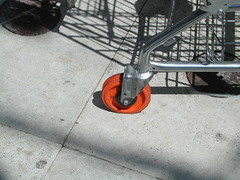
broken shopping cart

Image by jfrancis via Flickr

Small things can make a big difference in your conversion rates (that’s the percentage of people who click through and sign up or buy or whatever you want them to do).

Here are some examples of how your shopping cart and call to action buttons may be hurting you, and how to fix them.

Poor wording

If your call to action is weak, it will reduce the number of clicks you get. Test different options, such as “claim your copy”, “add to cart” or “sign up here”. See which gets more clicks. You can use Google’s Content Experiments or Unbounce for this.

Dull colors

Brighter colors work better (ever wonder why paypal and Amazon buttons are orange?). Red is good too, but some people can’t see it. Also, make sure whatever color you use stands out against the rest of the site. Light green buttons on a dark green background won’t help.

Small buttons

Here’s one place you can make something big! Bigger buttons are easier to find and easier to click on.

Buried buttons

Have at least one button “above the fold” (meaning without scrolling down). If it’s a product page, have the button right up top (think Amazon again). If it’s a sales letter, put at least one button near the top. Some people decide after a few paragraphs, others need more information.

Blinking buttons

They’re annoying (who wants their site to look like a neon sign?) and distracting.

Illegible type

Tiny font sizes won’t help. Online, a sans serif font (like Helvetica) is easier to read than a serif font (like Times Roman).

Affordances

That’s just a fancy word that means something is well-designed for its intended use.  In other words, your buttons should look like buttons.  You want something that looks as if it should be clicked, is a link with a different color, or has a shadow.  It’s hard to describe without a visual, but luckily unbounce has a video on button affordances.

Bonus tip:

Use a burst (think sunburst). It’s an old direct marketing trick, but it works online too. It draws attention to what you want people to do.

Is Having a Marketing Plan Enough?

I was about to start typing today’s post when the phone rang. The woman was talking so fast I could hardly understand her (and I’m from New York, where we all talk really fast).

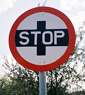
unusual stop sign

Image via Wikipedia

Me: “Whoa, slow down. What is it?”

Caller: “It’s about your merchant account.”

Me: “I don’t have one.”

Caller: “But you want one.”

Me: “No.”

Click.

You can have a great marketing plan. You can identify a niche market, grab a list somewhere, and start making phone calls or sending emails.

But, it will all fail if you’re not solving their problem, rather than yours.

Someone at the company where this woman works decided that they wanted to reach businesses like mine.  They created a marketing plan, hired people, and started calling.  They never stopped to think whether I needed what they were selling. Or whether a merchant account fit my marketing plan.

I don’t want a merchant account. I’m not a retailer. Paypal is fine.

They’ve just wasted my time, their own employees’ time, and probably quite a bit of money on a marketing plan that won’t work.

Before you start selling your idea, see if your audience wants it.  Otherwise, you could end up with a bra dryer or nail polish for cats.

Marketing plan essentials

To be effective, a marketing plan has to start with the audience, not with the product.  Then you build out the rest based on what the audience needs.

  • Start with your ideal client.  Who are they?  What do they want?  What troubles them?  What are they afraid of?  What do they dream about?
  • How can you fix those problems? Or fulfill their dreams?
  • Where can you reach/find them?
  • What appeals to them and what do they hate?
  • What tools will you use to reach them and where will you use them?
  • What offer will you make to them (price, product, terms)


Real Estate Marketing Mistakes

Know how they run those ads before the movies? The ones for local businesses? Haircuts, casual restaurants, real estate agents and so on?

Given half a chance, most people seem to ignore those ads in favor of keeping their noses in their phones, or munching on popcorn and snacks.

Captive audience, bad message

There was one the other day that stuck in my head, but for the wrong reasons. It promised XYZ Real Estate was a “cutting edge” company, a leader in real estate since _____ with innovative solutions.

I’m not in the market for a house (don’t have the $4,000,000 it takes to buy one around here), but if I were, this company would not be at the top of my list.

They’re trying to build themselves up, rather than tell me how they can help me.

No differentiation. No niche. And no message that matters to a client. They’ve spent a lot of money on a marketing mistake that likely won’t get them many sales (or even phone calls inquiring about their services).

A better marketing idea

Why not skip the useless gobbledygook and offer something that does matter.

For instance, how about help getting a loan. Or a list of 10 things I need to know before I buy a house. That wouldn’t fit in a movie ad, but a phone number to call would.

Or, what about an offer of relocation assistance (what’s in my new neighborhood, getting kids enrolled in school, local grocery stores). Another tactic could be specializing in townhouses or condos or large families needing a home (space is at a premium in New York).

Any of these strategies would have made this real estate agent really stand out. And get more clients too.

What do you think?

Do you pay any attention to those ads? Do you like them? Hate them? Do you want some popcorn? 😉