Marketing Lessons Learned From Netflix

DVD-Video bottom-side

Image via Wikipedia

I’ve been a happy customer of Netflix for quite some time. Being able to watch whatever I want whenever I want, and binging on my favorite shows is great; I feel as if I have my own movie theatre/TV station.

But yesterday, Netflix had an uncharacteristic epic marketing failure. Their subscribers are in an uproar (and rightly so).

New pricing failure

You see,  Netflix just announced a new pricing plan, which essentially increases the cost of the service by 60% (with no new benefits of any kind). They want to separate streaming and DVD viewing into two separate services, with separate fees.

Either you pay more, you give up streaming (convenient, but limited selection), or you give up DVDs by mail (slow, but much larger selection).

Almost worse, the name they chose for the streaming service is… .unfortunate.

Netfilx is a great company, but in this case they’ve failed basic marketing 101

Marketing 101

  • If you increase prices, give more value; especially if the increase is this large.
  • Tell your customers first – then send a press release.
  • Don’t end your blogger (?!) blog post by reminding people they can cancel at any time.  Yep, that’s what I’m going to do, because you just told me you don’t care at all about my business.
  • If you’ve got bad news, don’t pretend it’s good news (or, don’t pee on my leg and tell me it’s raining).
  • Soften the blow to your loyal customers by grandfathering them in, or giving them something extra (a better plan at the higher price?)
  • Remember that your loyal customers got you where you are today (don’t get them mad -5000 comments on the blog so far and 32,194 on Facebook).
  • Don’t drink your own Kool-aid – this kind of decision may look good to brokers and bean counters – but the customers pay the bills (no subscribers, no income)

What do you think?  What could Netflix have done better? Do you have Netflix?  Will you keep it?

Update:  Just saw this post by Derek Halpern of Social Triggers on the right way to raise prices.

How to Go Broke With Your Bad Sales Letter

Empty Pockets

Image by danielmoyle via Flickr

Writing a sales letter is a bit of an art.  You have to grab attention, make your case, and make it clear what people will get by responding.

If it’s online,  you have the benefit of lots of colors, graphics, maybe even video and sound.  If it’s in the mail (no, direct mail isn’t dead) your words will have to do all the work.

Ignore do not mail requests

I recently got a letter from Chase bank, urging me to get a credit card.  Two things, one I’m on the do not mail list (boom, they just violated that).  Second, the reason I don’t have a Chase Visa is because they canceled it. However, back to the letter.

Confuse people

The envelope said “Chase”, but the sheet inside says “Slate” across the top.  I have no idea what Slate is.  Never heard of it.  It’s rather confusing.

Be irrelevant

It offers me savings on gas (oh good, something I never buy).   And more savings if I pay with Full Pay (whatever that is). Also, I can add or change categories at any time (categories of what?).

Bait and switch

There’s also a low APR initial rate (bet that goes up).  And, my favorite part, the opportunity to opt-out of further mailings if I call a toll-free number.  I’ve already asked that (I’m on the do-not-call list too).  Fail!

How not to fail

OK, so my refusal to apply won’t make Chase go broke. But, if you sent a letter that showed such a poor understanding of your audience’s needs and wants, you would go broke (and fast).

Writing an effective sales letter, especially to a new prospect, or for a new product, has to do a better job than that. It needs to:

Tune in tomorrow for Friday Fun. There may be some fireworks.

10 Virtually Instant Ways to Improve E-Newsletters

High Speed - Lights

Image via Wikipedia

Your e-newsletter is your link to your prospects and your clients.  So, it’s important to make it useful, relevant, and helpful.

Here are 10 quick ways to improve your e-mail newsletter marketing and get better results.

1. Limit the number of steps to sign up

The more questions you ask, the lower the opt-in rate will be.  Make it as simple and easy as possible.  Name and email are best (or even just email).  Don’t ask anything else unless you have to (for example if you’re sending fashion tips, you’ll need to know gender.

2. Review your sign up process

Spell out what they’ll get when they sign up (a book, a video, an e-course), how often they’ll get it (monthly, weekly, daily), and the kind of information they’ll receive (graphic design tips, reviews of the latest camping gear,

3. Check your confirmation page

Does it spell out exactly what will happen next?  Are the instructions clear?  If yours is confusing, change it.  Sometimes, people see “subscribe” and think they need to pay, others see it as a reminder that they’ll be getting regular information and emails.  Experiment with the wording and see what performs best for your readers.  Make sure you ask them to whitelist you too (add your email to their address books), so the message doesn’t fall into the spam folder by mistake.

4. Include links back to your blog

This gets more clicks and traffic back to your site.  Add links to posts that expand or complement the topic of that particular issue. Or, highlight the best posts of the past month/week (depending on your frequency).  Include posts by other people too (as long as it’s useful and relevant to your audience – no sneaking in tips about hiking gear to a newsletter about decorating with stained glass.

5. Tweak the design

If you’re using HTML (graphics) for your newsletter, take a look at the design. Is it easy to follow?  Or, are you trying to cover 5 or 6 different topics at once? Add more white space, to make it easier to read.

6. Cut down the content

Sometimes too much information can be overwhelming.  Try three articles instead of six.  If there’s one primary article or topic, make it bigger than the other two (but not too big, or it will drown them out).  Edit ruthlessly.

7. Add more calls to action

If you want people to do something (like watch your how-to videos), ask more than once. Make it clear that’s what you want (“watch the how-to video”).  If you don’t ask, you don’t get.

8. Test your subject lines

Which gets more opens and clicks?  Subject lines with questions (Is HTML better than text?);  subject lines with numbers (4 Things Your Website Must Have)? Or a subject line that promises something (Turn Your Trash into Cash)? Remember, what works for me, or for your friend, or for a famous blogger may (or may not) work for you.  Each audience is different.

9. Be consistent

Send it around the same time, on the same day each week/month/day.  You can schedule this easily in AWeber.

10.  Ask for feedback and encourage replies

You can put up a survey in Google docs (or use survey monkey) if you like.  Or, just make it clear that your virtual door is open.  I include a note saying that if you have a question or comment you can just hit reply.  It goes straight to my personal inbox.

What the New York Times Could Learn from a Lingerie Blog About Tribe Building

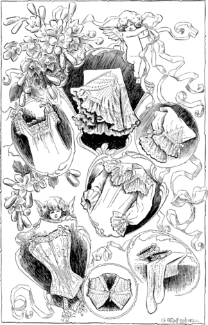
Bridal Trousseaux; Some Dainty Lingerie

Image via Wikipedia

The New York Times recently announced that they would start charging for access to their online paper.

Beginning March 28, if you want to read more than 10 articles monthly, you have to pay at least $15 for the privilege.

I like reading The Times, but not enough to subscribe to the paper version (the delivery is terrible and then I have to worry about getting rid of the old papers).

Online marketing and paywalls

Charging for something that used to be free is always tricky.  The best way to approach it is to offer additional goodies or some sort of extras for subscribing, such as a free book, or no ads or special access to extra features.

Sadly, for all their smarts, the paper isn’t doing any of those things. They’re not adding any value either.  You pay and still get ads.  There’s no extra goodies (insider access or points or recognition of any kind).

Is there added value?

Unfortunately for The Times, internet users have been “trained” that online is free.  That you pay when  you get something extra, or special (ad-free viewing, or badges, or priority service).  The few news paywalls that have worked are for specialized information, or instances where a company is paying for the subscription and the consumer doesn’t “feel” it.

The story about the fees got over 2,000 comments (before they closed it!).  2,000 comments.  That’s one heck of a tribe – if they only wanted to embrace it.

I’ve been reading The Times for years, but I think I’ll start reading CNN, NPR, and the BBC instead. They’re not giving me anything special or unique.  I can get news elsewhere.

Young lingerie addict v. “the old gray lady”

On the other hand, I know a woman in her twenties who runs a growing lingerie blog.  She’s young, but she’s figured out something the “old gray lady” has completely missed.

She’s got a facebook fan page/wall.  She posts pictures and videos.  She interacts, she guest posts.  She responds to comments, she tweets, and has a tumblr.  She’s building a brand and a crowd of loyal fans.  Do they like her?  Yes they do.  Her blog is free, but she offers other services that aren’t.  General information is free.  Personal attention or merchandise costs money.

Would they miss her if she disappeared?  They would. Unlike the Times, she’s giving them something they can’t get elsewhere.

If you wanted to build your tribe (loyal buyers), what would you do?  Start a recognition program (client of the month)?  Offer badges to top commenters on your blog?  Welcome new readers? Extra access/higher priority service for those who pay more?

What do you think the Times should have done?

The Worst Marketing Idea Ever

Against

Image via Wikipedia

Have you heard about the new Facebook feature? It’s called sponsored stories. Facebook has a reputation for shall we say “aggressive” marketing. But this is one of the worst marketing ideas ever.

Here’s what it does.

It takes something you post to your friends, check-ins and likes from other websites and highlights them in the right-hand column of their pages.  They call it a “sponsored story.”

It almost sounds useful, but it’s actually a terrible idea.

So wrong. On so many levels.

First, they take your content, without permission or compensation of any kind. They don’t notify you that they are doing it. And, in fact, there was also no advance notice of the new feature.

Second, you cannot block your content from becoming an ad. There’s no opt-out.

Third, it works for anything you “like” on the web (not just on facebook). So if you “like” something on “Wired”, and “Wired” buys advertising, your “like” becomes free advertising. If you mention you just had a Budweiser beer, your post becomes a Budweiser ad (they’re one of the early sponsors).

Fourth, they’re using your posts to spam your friends. The content goes out with your post, and your name on it.

Fifth, they’re charging advertisers money for this.

It’s theft, it’s interruption, and it’s spammy.

Have you heard of this? What do you think? Am I right? Or doesn’t it matter?