There are several elements that every landing page needs in order to convert.
If you don’t know what a landing page is, it’s a page on your site that is set up specifically to ask for an action: this could be signing up for a newsletter, ordering an ebook, or registering for a webinar.
Think of it as your 24/7 sales page. The page that works night and day, answering questions, selling your products, and helping your customers (even when your company is closed).
Start with a headline
The first thing your page will need is a great headline. This is the first thing readers will see when they get there, and it has to grab their attention right away. If not, they’ll just click away.
If you’re sending readers from an ad campaign or an email message, make sure the headlines match. This tells visitors they have come to the right place.
Build on the headline
Did that headline make a big promise? Or offer to solve a problem? Are you directing it at a specific group of people?
Build on the attention you got with that headline. Tell readers how you will deliver on that promise. Show them you understand the problem they are having and that you really can solve it.
Use simple words
When you know too much about something, and how it’s supposed to work, it’s difficult to look at it without that “curse of knowledge.” Instead, use clear, simple language. This is not the time to show off your vocabulary or lard your page with jargon.
Resist the temptation to use technical terms (unless you’re absolutely sure that your audience knows them). I recently reviewed a site discussing great PC apps – the writer talked about P2P, winamp, and VPNs. I know what those things mean (since I speak conversational geek). The average computer user probably doesn’t.
Talk in terms your audience will understand (without running to Google, or worse, leaving your site in frustration).
Clear instructions
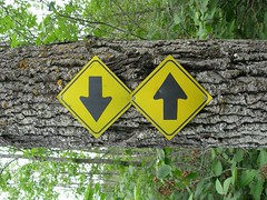
See the sign at the top of the post? It’s in a park in Canada. Should you go left? Or should you go right? What would you find in either direction? Restrooms? Restaurants? Lodging? Flower gardens? I can’t tell what the people who posted the signs want me to do. Can you?
Same thing with web sales pages. If you’re not clear about who you are or what you want people to do, they’ll click away from your page, leave your site, and never come back.
Stay focused
Have a single object in mind (that sign up for instance). Know what you want people to do when they get to your page. Sign up for a newsletter? Buy something? Click on more articles?
Ask for one thing
Don’t overwhelm or confuse people with too many choices. Use those big call to action buttons. Explain what readers will get when they sign up, and how often they’ll receive it.
I spoke to someone recently who set up his website with several pages discussing his services…and no clear call to action. Instead, he had links on the side he was hoping people would click on to find out more. No clear call to action.
Experiment and test
If your page isn’t doing as well as you’d like, experiment. Try different calls to action. Move the buttons around. Test different versions of your page against each other. Track the clicks and the sales to see which version performs better.


