Get More Clicks on Your Calls to Action


Have you got calls to action on your site? What is a call to action anyway?

Examples of Calls to action

Not quite sure what a call to action is?  It’s the button, the sentence or the line in a script that tells your readers to do something. It might say, “buy now” or “instant access” or “get your free ebook.”

There are lots of ways to word it, but the key is to make it as appealing as possible.  The more urgent and attractive the offer seems to your readers, the more clicks you’ll get. More clicks means more downloads, more subscribers, and more orders. Here are some examples of how to improve your call to action.

Have a call to action button

I know, it seems obvious, but sometimes it gets left out. If there’s no way to order, ask for the free information guide, or sign up for your newsletter, you won’t get orders or get inquiries. It sounds odd, but there are plenty of Web sites with hidden contact information and no button or phone number.

Make your call to action colorful

Sometimes web designers get caught up in making something beautiful, rather than functional. I’m not advocating yellow highlighter and red type, just buttons that are big, that stand out from the background, and are clearly marked.

For example, if the other buttons on the site (contact us, support, etc) are white, make the call to action blue.

If the button is by itself, contrast it with the rest of the page (so, if the background is white, make the button red).

Make the call to action prominent

If they can’t find it, they won’t click on it.

Layer it over other page elements. Or, make it larger than other buttons on the page (such as related posts or continue reading). Put it in a prominent place, such as the top right hand corner of the page, or in the center.

Put lots of space around YOUR BUTTONS

Set off the call to action button from other text or design elements on the page. If there are other button options, such as a “learn more” vs. a “buy now,” put lots of space between the call to action button and the other buttons on your page.

Test the wording

Try out different wording, such as “subscribe now” vs. “get your copy”) or “try it now” vs. “free demo.”  More examples of calls to action.

Make it clear what to expect

If there’s a download, or a newsletter, or a free e-book, make it clear exactly what will happen, and whether there’s a fee (either in actual money or an email address). If it’s confusing, people won’t click.\

Button image from stylewebdesignusa.com

What do Landing Pages Have in Common with Grade School?

classroom
Remember back in school when the teacher assigned homework on current events? First you had to find a story, then you had to play reporter. You always had to talk about WHO, WHAT, WHEN, WHERE, HOW, and WHY.

Well, landing pages are like that too. In case you’re not familiar with them, a landing page is a Web page set up as part of a promotional campaign. You develop them as a arrival point for different products and services based on keyword searches, email campaigns, TV, or even print.

What does this have to do with current events homework? The landing page has to follow a similar format.

WHO: Who are your customers (seniors, teenagers, business owners, moms, VPs of Marketing)?

WHAT: What are you selling, and what do you want people to do once they reach your page?

WHEN: Is the offer limited? Must they act now? Or is it “evergreen”?

WHERE: Where should visitors go on your page? Is it clear?

HOW: How do they respond or order? Click on a button? Call?

WHY: Why should people buy from you? What problem do they have? How do you solve it?

Focus on one thing only. Don’t try to sell four or five things on the same landing page. If you want to promote five products, make a separate page for each one. Make the call to action (click here, buy here) clear and big and obvious.

I saw a landing page for a summer camp recently that looked like a calendar. It listed several different sports (basketball, baseball, etc.) and the dates, but had no information on why anyone would want to send their child there. There were no clear buttons to sign-up or get more information.

The page had too much text and not enough pictures. If you operate a summer camp, have different pages for each sport. Show pictures of happy children playing. Paint a picture in words of the fun the children will have.

Organize the site for the buyer, not for yourself. Include separate menu bars for each audience. Use emotions, make them see the product. If you sell fruit, don’t say we have apples, pears, oranges, etc. Say, “these ripe, juicy Bartlett pears are so sweet and delicious you’ll need a napkin handy to wipe your chin.” See the difference?

Now go do your homework.


Do You Make These Six Web Site Mistakes?

Does your Web site invite visitors to linger? Or drive them away? The first few seconds are critical to making a good impression. Here are six common mistakes many business owners make (and how to fix them).

1) Graphic-heavy sites that take a long time to load. If it takes 20 seconds on a fast connection, it’s too slow. Amazon loads in a second or two. Rethink the size of your images, and in most cases, ditch the Flash intro.

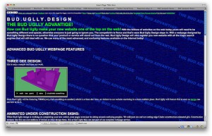
2) Light type on a dark background. I just saw this twice yesterday. It’s hard to read. Use contrast, and a light background with dark type for better legibility. Reading on a computer is harder than on a printed page. If you’re not sure what colors to  use, try color combos.

3) Fuzzy solutions to unclear problems. Be clear about who your customers are and what problem you solve. Talk about the pain they have (not yours) and what you’ll do to make it stop. One of the sites I looked at yesterday said was offering web hosting services. It said, “Want to build your Web site, we’ll do it for you.” It’s unclear who the customer is or what the benefits of using this company are. Is the site for people with technical know-how who want a reliable web host? Or, is it aimed at people who don’t know (or care) how to build a site and want someone to do it for them?

4) Asking for love, without trust. Would you ask someone to marry you after the first date? Or, as Chris Brogan vividly puts it, “put your tongue in the ear of someone who is trying to shake your hand?” Of course not. So, don’t put up big buttons asking people to follow you on Twitter, or spread your name to social bookmarking sites, unless and until you have gained their trust. Give them something worth spreading first. Be worth talking about. Then, and only then, have you earned the right to ask for something in return.

5) Unclear target customer. This same web hosting company offered bulk transfers, SSL certificates, and all sorts of complicated Web services. It was also promoting site building help and ease of use. One set of offerings seemed meant for beginners and people lacking Web expertise. The other set was targeted at network administrators with high-level technical skills. They were all lumped together and it was confusing. If you must sell to two such different customers separate the pitches. Have one page or menu button leading to information for beginners and another with information for experts.

6) Hard for new visitors to use. It may be obvious to you, but not your visitors. Have someone new try it. Watch them while they do it. See whether they can find what they want easily. Check what they read, and what they skip over. Darren Rowse has a First Time Reader Audit with more details (he’s talking about blogs, but the principles apply to Web sites too).

Photo: cogdogblog

Is Your Web Site Search Broken?

broken egg imageTwo weeks ago, I ran out of fax toner. Staples didn’t have what I wanted, so I turned to the Internet. I found a site that sold ink and toner (so far so good).

I plugged the brand and model number into their search tool… and was sent to the main page for that brand.

There were about 20 pages of toner! I couldn’t find the one I needed unless I looked through each and every one. Not good.

So, I emailed them saying I need Brand X, model Y. Do you carry toner for that? I got an automatic message thanking me for my inquiry…. and nothing since. Now, here I’d raised my hand, saying, ‘hello, I’m a prospect, I want to buy from you.” And nobody cared.

Two important marketing lessons:

1) If you build a search tool into your site, make sure it’s easy to use and delivers visitors directly to the information they’re searching for. Don’t make it hard to buy!

2) If you have a contact button (and you should), follow up on the questions. Ignoring customers (or potential customers) is costing you both money and goodwill.

Image thanks to: stevendepolo