How to Write a Landing Page That Converts: 10 Secrets That Really Work

On Target

Image by viZZZual.com via Flickr

If you don’t already know, a landing page is a special sort of page on your web site.   It’s a page designed for one thing, and one thing only – to generate action. This could be a sale, a newsletter signup, or a lead generation form.

Here’s how to write a landing page that converts.

In order for your landing page to work, you’ll need these ten essential components.

1. A great headline

The  headline pulls people in and tells them that there’s something on the rest of the page that they will be interested in reading.  It promises to solve a problem, help them learn something, save money, or perform better.  It’s the most important part of the page – blow the headline and you’re sunk.  Luckily, there are some proven ways to write great headlines.

2. Testimonials

This is proof from other people that what you’re selling or offering really works.  It’s called social proof. It helps you build credibility online (or off) with people who don’t know you. Include full names (Bob L., from Kansas isn’t very reassuring), and a photo (if you can). The testimonials should be as specific as possible. For instance, “My teeth used to be dull and yellow, but after using Dr. Rick’s super-bright smile booster for one week, they’re now dazzling white and beautiful.”

3. A photo of the product

People like to see what they’re getting.  Put in a picture.  If it’s an e-product, create a representation of it (such as a book or a CD).

4. Ask for one thing

And one thing only.  Don’t try to get a newsletter signup, a tweet, and an ebook purchase all on the same page.  Even if it’s something that’s going to be in front of lots of people.  You’ll just confuse people. You’ll also dilute the response you get, as it will be spread out among two or three things.  And make sure it’s absolutely clear what you want them to do.  Make it a big red button.

5. State the benefits

Tell your readers what they’ll get.  You made the promise in the headline, now explain how it works.  What results will they get?  What problem does it solve?  How long does it take?

6. Sub-headings

It’s tough to read a big block of text (especially online).  Plus, there are two ways people read.  Some read every word, many just skim the headlines and sub-heads – and then stop to read the full paragraph when they find something interesting.  Allow for both.

7. Multiple order buttons

People click more when there’s more than one button – even if it goes to the same place.  Use two or three and distribute them throughout the page(depending on how long your page is) .

8. A big, fat guarantee

Stand by your work. Offer a money-back guarantee.  This is another way to show credibility – you’re so sure that your product will work, that you’re willing to risk a refund.  You’ll actually make more sales with a refund.

9. A value statement

Explain how much the product(s) are worth, compared to the actual price.  If it’s an e-book, compare it to  your hourly consulting rate. Or several products (sold separately) to the price of one product.

10.  A thank you

After someone fills out your form, or buys your product, thank them.  You might also suggest they do something else, such as read your blog. Or, explain what will happen next – whether someone will call them, or how the rest of the delivery process for the e-book works. Besides, it’s polite.

Secrets of Successful Landing Pages

An eye-tracking Heatmap showing where a subjec...

Image via Wikipedia

A roundup of tips to help you create better landing pages. The image on the top right is a heat map – tracking where people look the most when they view a page. Red is HOT!

Get a Great Landing Page

How to Write a Landing Page

10 Steps to Landing Page Failure

What Do Landing Pages Have in Common With Grade School?

How to Get a Great Landing Page

victory image

Image thanks to svilen001

A website landing page is the sales pitch you can’t give in person. It’s the page that does all the heavy lifting of selling your product or service.  If your visitors aren’t buying your product, your landing page may need a makeover. But how can you make your landing page more effective? What makes a great landing page?

In order to be effective, your landing page needs the following: a great headline, an introduction (for people who may not know you), information about what you offer (and its value to your readers), the problem you solve, proof that it works, and an order button (or two).

A compelling headline

A great headline will get attention.  A poor one will be ignored.  If the headline is no good, nobody will read the rest of the copy.   Write a headline your readers can’t resist: create a sense of urgency,  create a contradiction, or promise an easy solution to a hard problem.

An introduction

Remind people why they came to your landing page.  Talk about the problem that your visitor has – which you can fix.  Or, get them excited about the cool tool or exclusive access they’ll get (but only if they buy).

Add more value

Then, you build on that.  Tell the visitor more about the benefits.   You can use bullet points,  but if you want a great landing page, they’ve got to focus on benefits, not features. Say, for example, you’re selling a cookbook.  Tell me about the delicious food I’ll be eating.  Show me pictures of it.  Give me a “taste” of the recipes.  Make my mouth water.  Explain how I can have a great dinner on the table in under 20 minutes (or whatever the premise of the book is).

Answer questions

Sales letters are often long because there’s no live person handy to answer questions.  So, you’ve got to include all of them (or at least the most common ones).

Add even more value

If there’s special access (book and limited consulting slots, special membership forum), tell me about that.  Why is it special?  What will it do for me?

Have a great guarantee.  Explain what it is, show how it removes the risks, and what to do if they need to use it.

Ask for the order

“It’s easy to get your copy, just…(click on this button, call our office, fill out this form).   Give exact instructions.  Spell it all out.  And, make sure you explain what will happen after they do so.  Have buy now links throughout the page — but not at the very top.

Show proof it works

Get testimonials. If your product is new, send out some samples.  If it’s not brand-new, get reviews from other clients who have used it.  Use their words (not yours).

P.S.  Don’t forget the P.S.  It’s an old direct marketing technique.  When people get a sales letter, they read the salutation, then look at the end. Like you just did.  😉 Because, after all, we all want our marketing to be successful; trophies are good too.

P.P.S. If you’re in the U.S., enjoy your Memorial Day weekend.


How to Write Landing Pages That Convert

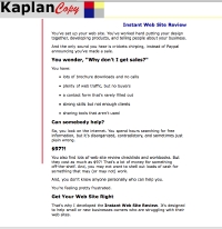
web review landing page imageGreg called yesterday wanting an opinion on his landing page.

He asked, “Does it suck?”.

It did.

“Should it be longer”?

It should.

“I don’t want it too long.”

It should, I said, be like Abe Lincoln’s legs; long enough to touch the ground.

A landing page is your 24/7 cyber-salesman

When you’re talking to someone directly, you can answer their questions, respond to their concerns, and make sure they know everything they need to know about your product.

Since you can’t be there in person, the landing page has to answer any questions on your behalf.  It’s got to address any objections the buyer may have about price, features, future obligations, benefits, who you are, why you can help them, and whether you’re trustworthy.

In order to be effective, the landing page has to do four things: has to get attention, explain your offer, demonstrate the benefits, and give them a call to action.

That’s it. No more. No less.

No Twitter feed. No LinkedIn profile. No newsletter signups. Those are all distractions.  Leave them for other parts of your site, but not on a landing page.

How to write landing pages that convert:

In order to make more sales, your landing page will need the following:

  • An explanation of why you’re talking to them. Make it clear exactly who your audience is, and why your product is relevant
  • Details of what the product is and does (a seminar on using LinkedIn, an ebook on how to write ebooks).
  • Information on what buyers/registrants can expect to get by signing up. What will they learn? What problems will your product solve?
  • Common questions and answers. Think of the questions they may have. What topics will you cover? How will knowing that information help them? What will it cost? How long is it?
  • Proof that it works. Testimonials from satisfied buyers, before and after photos, or your own story (here’s how I did it).
  • A call to action
  • What to expect next (the details of the sign-up, or buying process – what emails they will get, delivery time, confirmation of the order, etc.).

If you get stuck, try writing the end first. If it’s a seminar, put in the date and time it will be held, the cost, and what people have to do to signup. Write the call to action. Insert spaces for the shopping cart buttons.

Call a friend and explain it. Or, record yourself talking about it. Write down what you said.

Or, you could contact a professional. 🙂

Share your thoughts

Do you use landing pages for your products and services?  Got a different approach or technique that works?  Anything else you add? Share it in the comments.

10 Steps to Landing Page Failure

abandoned stone stairs image

Image thanks to: abcdz2000

Even the most experienced marketers can mess up a landing page.  Sometimes, it’s trying to meet a tight deadline. Other times, there are too many people (client, designer, writer) clamoring to make changes.

On other occasions, it’s simply being “too close” to the project.  When you know how everything is supposed to work, it can be hard to realize that an outsider could easily be confused or distracted.

Here are ten key things that can mess up your landing page (and how to fix them).

1. Lots of other content

I just looked at a landing page with links to sub-topics. blog archives, top posts, and a store. It also featured ads for other products, some of them animated. It was confusing and distracting.

Make your landing page distraction-free.  Remove all the navigation links, the link to your blog, anything that isn’t absolutely necessary.  Some people even make the landing page its own domain.

2. Sharing buttons

Sharing is great, but it’s not your first priority for a landing page. You want people to take a specific action (buy something, or sign-up). Don’t distract them with Twitter links. They buy from the landing page, not Facebook. You may get a new Twitter follower or two, but that’s not a sale.

3. RSS feed

Sure you want more subscribers to your blog, but this isn’t the place for it. You want to zero in on one thing – getting more people to download your book and subscribe to your newsletter.

4. What’s in it for me?

I saw a blurb recently with information about the sources for an e-book’s content, but very little about what that content actually was. Tell readers why they will want to read what you wrote. What will they get from it?

5. Dull title

Calling your book “Dinner menus” won’t attract much interest. Instead call it “Dinner in 30 Minutes.” The title should attract attention, arouse curiosity, and encourage readers to want to learn more.

6. Too vague

Share some hints about what’s inside. Continuing with the cooking theme (I must be hungry), list some of the recipes: Chicken in Basil Cream, Almond-Coated Trout with Sage, Linguini with Pesto Sauce. Be as specific as possible (without giving everything away).

7. No authority

Be clear about your credentials to discuss and advise on the topic. In this case, it might be parent of three children, or testimonials from previous subscribers about your great recipes.

8. Ads for irrelevant products

A banner ad for car insurance won’t help you get subscribers to your Android apps newsletter. Neither will your twitter stream or recent blog comments. Keep those things for your normal blog pages (not landing pages).

9. No clear audience

Who is this for? The likely audience for our hypothetical cooking ebook is busy moms. Talk in terms that will appeal to them.

10. No benefits

Tell them why they need this book. “Get dinner on the table fast. Delicious, quick meals your kids will actually eat. And, they’re so good, you’ll love them too. No more making separate dinners for each member of the family.”