How to Hire a Graphic Designer

Need a new logo?  Or illustrations for your web site? Maybe a brochure?

Not sure how to hire a graphic designer?  Or what to look for?

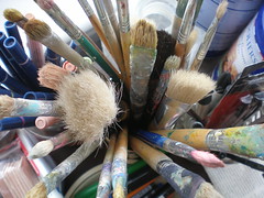
An artist's tools

Image by Stepheye via Flickr

You can search on Google or elance for ‘graphic designer’ or ‘logo design” and get a long list of designers anxious to be hired.  But are they any good?  And do they have the right skills for your job?

Here’s how to sort through all those names and hire the designer who is right for you.

Offline or online skills

Brochures require different skills than web design.  Web mistakes are easy to fix.  Printing errors are costly and time-consuming.  Ask them if they have experience with the type of project you have in mind.

Think about how your design will be used.  Web only? Or web and print? Low-resolution images are OK on the web, but will look awful in print. Web colors and print colors are generated differently, so colors will look different in print than they do on the web.

Design style

What sort of “style” do they have?  Closer to a cartoon? Or more like a painting?  Look for a designer whose portfolio matches the result you have in mind.  A designer who specializes in anime might not be a good fit for an insurance company.

Process

How do they work?  Do you chat in advance? Give them some background on what you’re looking for, the kinds of other sites/brochures you like?  How many design ideas are included?

If you will be using photos, who is responsible for finding them (and getting permission to use them)?

Payment

Normally, a designer will ask for a portion of the total price upfront, then an additional payment when they present design ideas, and a third on completion and approval.

Your vision

What colors do you want to use?  Have you chosen a style?  Do you want any specific elements (all type, type and graphic images, fire engines, wizards)? How is your business different?  How do  you want to convey that through color and design?

Get recommendations

Ask to see samples of their work.  Contact references, and look for testimonials.  Or, check my resources section. If you don’t find what you’re looking for, send me an email.

How to Design Ads That Get More Sales

In Confessions of an Advertising Man, David Ogilvy wrote, “Most copywriters think in terms of words, and devote little time to planning their illustrations. However, knowing how to design ads is just as important as knowing how to write them.

advertising

Image via Wikipedia

The illustration often occupies more space than the copy…it should telegraph the same promise that you make in  your headline” (for those under fifty, the telegraph was the 19th century’s version of instant messaging).

The way your ad looks is just as important as what it says (Yes, I know copywriters and designers clash about this. I’ve already written about marketing vs creatives. That doesn’t mean the words aren’t important too. Don’t worry, we’ll get to that in a later post).

Use photographs (not illustrations)

Photos draw more attention.   You want something that says clearly and immediately what your ad is about – something that tells a story.  Try before and after photos or an empty chair with a book nearby.  Or a dog gazing out the window.

Skip the pretty pictures

Avoid softly lit and carefully composed images. You don’t want award-winning, you want sales winning!

Make the logo bigger

I know it’s sacrilege, but it does work, especially if your clients and customers already know and trust you. It activates the “warm fuzzies” in their heads.

Try “direct marketing ugly”

This means starbursts, Courier or Times Roman type,   and minimal colors.  It often works better than something ‘pretty.”  Test it and see.  Some scoff at this, but it’s been working well since Claude Hopkins set down the principles of Scientific Advertising in 1920.

Add captions under the photo

People read them (more often than they read the article).

Use subheads – and bold them

Some people read everything, others scan.  Give the scanners enough to look at so they still get the story – and want to go back and read the bits they missed.

Keep your type at a readable size

11 or 12 points is best in print, make it 14 online.  Smaller than that and people can’t read it (if your audience is older err on the side of larger!).  In print, a serif font (like Times or Baskerville) is better.  Many prefer sans serif (like Arial) online, because the resolution of pixels on a monitor is harder to read than a printed page.

Light background, dark type

You can use black on white, dark blue on pale grey, or whatever colors appeal to your audience – just don’t reverse out (white type on dark background) large blocks of type.  It’s really hard to read.  You want people to keep going (not slow them down or frustrate them).

Break up the copy

Avoid one or two big blocks of  square text.  It’s pretty. but it’s harder to read and follow along.  Use bullets, arrows, and numbers to help readers follow along – and highlight the important stuff.  If it’s long copy, add some boldface subheads, block quotes or other eye-catchers to break it up.

Add leading

Leading is the space between lines (named after the actual lead that separated lines of type back in the days when it was set by hand with metal letters).  It’s easier to read the copy.

Oh, and these tips work online too.

Powerful Graphic Design Marketing on a Shoestring Budget

shoestringIn yesterday’s post, I recommended several ways to use social media to market your business.

I suggested that you find groups online and participate.  Here are some more specific ways to do that (without spending a cent).

Say you’re a graphic designer and want to get more projects. You can:

Join business-related social media sites.

Offer a quick review or critique of existing graphic design. Use the forums to educate members about why design matters.  Don’t lecture on why you think Helvetica is the greatest font ever; instead focus on how better design leads to greater visibility and more sales.

Hold regular design hangouts (or webinars).

Give design and marketing tips.  Again, frame this in terms of how a high quality, optimized design leads to more money or more leads (which is what businesses generally want), rather than pure aesthetics.

Record those sessions and post them on your website (and/or youtube).

You’ll extend your reach, and drive more traffic to your website. It also gives you a backlink to your site. Post the links to the social media platforms where your clients (or potential clients) hang out.

Find blogs or youtube channels hosted by complementary businesses.

This might be women-owned forums, web design sites, or other places your target market frequents. Offer to guest post or be a guest on someone else’s show.  Use the show as an opportunity to offer a more personalized session, review, or other offer to viewers.  This might be something free, or a low-cost design audit.  This is not the time or place to pitch a big project; they don’t know you well enough yet.

Hubs and spokes

Use your own site as your “home base” and social media outlets as an outpost.  Post on your own blog (obviously), but also post in other places.  Offer a regular design “Tips Tuesday” or other regular feature.  Use this opportunity to invite your followers to join your webinars.

Have a specific work process

Spell out exactly how you work, and the steps involved, on your website and in  your social media profiles.  Make sure clients (or potential clients) know exactly who you work with, how the design process works, and understands the value of what you do.

Even if you’re not a graphic designer, you can adapt these principles to just about any freelance or small business.

Image nkzs

Act Now and Ban Yellow Highlighting Forever!

no_highlighterEver seen one of those sites with a really long sales page?

You know the kind, the ones with big, urgent headlines (Act Now, Or You’ll Regret It for the Rest of Your Natural Life). They’ve got big, red headlines, and lots of yellow highlighter.

They’re what we call “Direct Marketing Ugly” – urgent, in-your-face stuff that screams and jumps up and down, begging for attention.

It’s still used because it still works. However, if you’d prefer something a bit more low-key, try engaging your visitors instead.

Get people involved.  Ask them to submit stuff, biggest challenge, or offer a free analysis, or review.  Build trust by asking for opinions.