Does your Web site invite visitors to linger? Or drive them away? The first few seconds are critical to making a good impression. Here are six common mistakes many business owners make (and how to fix them).
1) Graphic-heavy sites that take a long time to load. If it takes 20 seconds on a fast connection, it’s too slow. Amazon loads in a second or two. Rethink the size of your images, and in most cases, ditch the Flash intro.
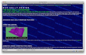
2) Light type on a dark background. I just saw this twice yesterday. It’s hard to read. Use contrast, and a light background with dark type for better legibility. Reading on a computer is harder than on a printed page. If you’re not sure what colors to use, try color combos.
3) Fuzzy solutions to unclear problems. Be clear about who your customers are and what problem you solve. Talk about the pain they have (not yours) and what you’ll do to make it stop. One of the sites I looked at yesterday said was offering web hosting services. It said, “Want to build your Web site, we’ll do it for you.” It’s unclear who the customer is or what the benefits of using this company are. Is the site for people with technical know-how who want a reliable web host? Or, is it aimed at people who don’t know (or care) how to build a site and want someone to do it for them?
4) Asking for love, without trust. Would you ask someone to marry you after the first date? Or, as Chris Brogan vividly puts it, “put your tongue in the ear of someone who is trying to shake your hand?” Of course not. So, don’t put up big buttons asking people to follow you on Twitter, or spread your name to social bookmarking sites, unless and until you have gained their trust. Give them something worth spreading first. Be worth talking about. Then, and only then, have you earned the right to ask for something in return.
5) Unclear target customer. This same web hosting company offered bulk transfers, SSL certificates, and all sorts of complicated Web services. It was also promoting site building help and ease of use. One set of offerings seemed meant for beginners and people lacking Web expertise. The other set was targeted at network administrators with high-level technical skills. They were all lumped together and it was confusing. If you must sell to two such different customers separate the pitches. Have one page or menu button leading to information for beginners and another with information for experts.
6) Hard for new visitors to use. It may be obvious to you, but not your visitors. Have someone new try it. Watch them while they do it. See whether they can find what they want easily. Check what they read, and what they skip over. Darren Rowse has a First Time Reader Audit with more details (he’s talking about blogs, but the principles apply to Web sites too).

