How to Write a Web Page vs. Writing for Print

writing for the web

Image via Wikipedia

Writing for the web poses some unique challenges compared to writing on paper.

It’s harder to read on a computer (even with retina screens) and people tire more easily.

Plus, there are more distractions. Unlike printed pages, web sites have ads that may move or blink. There are social media buttons, and of course, pinging email notifications.

All of this makes it a lot harder to keep someone’s attention on your article or post.

Here are some ways to overcome all of that.

Write in small chunks

A big block of text is OK on paper, but not on a screen.  The resolution on a printed page is much clearer than onscreen – and reading large blobs of text online can quickly become tiring.

Break up your paragraphs into small bits, three or four lines at most.  Then, add a paragraph break. I know, Strunk and White wouldn’t approve (but they never saw the web).

Use sub-headings

Add sub-headings to break up the text even more.  Many people skim, so a heading helps them stop and find exactly the information they’re looking for.  If  you catch their attention, they may go back and read more carefully.

Write with bullet points

Short bullet points also make skimmers stop and read more carefully.  If it’s a sales page, you want action words right at the front of those bullets.  If it’s tech specs or design specs, they’re much easier to digest than if you wrote them out in long sentences.

Use colors

Colors are free on the web.  Contrasting colors for headlines, or links, or buy buttons grab more attention.  Don’t go crazy though – you don’t want it to look like you’ve dumped a paint store on your page.  Don’t use too much of one color either (then it’s too bland).

Above all, keep editing and testing (unlike paper, it’s easy to change  your mind!)

Make the type larger

Even with ever-sharper screens, reading text on the web can still be tiring.  And, for older people (or those with poor eyesight) it’s difficult to read even a small section of text.  Increase the type size on your posts (or allow a zoom in/out feature). Unlike text on paper. the font size on the web is adjustable!

Have You Made This Common Web Writing Mistake?

writing web copyHave you done this?  It’s a common web writing mistake, and something that many companies, both large and small, often get wrong.

It’s a mistake that’s easy to make, but it can be a disaster.  Doing it can drive readers away from your site, reduce sales, and lower the time visitors spend looking at your site.

Luckily, it’s something that is fairly easy to fix, once you realize you’re doing it.

The gobbledygook trap

Can your readers understand your site? Do they find what they need easily? Or does it need a translator?

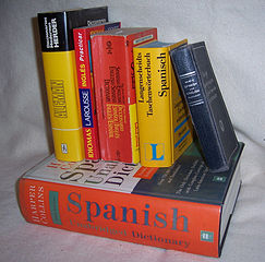
I don’t mean Google translate, or even copy that’s in two languages, such as English and Spanish.  I mean translation from “geek” to English, or “designer” to English, or even “web developer” to English.

Can your customers understand your web site?

Here’s some sample copy from Microsoft’s web site (for Word, under the heading “Work Together More Successfully”)

If you work for a company running SharePoint Foundation 2010 this functionality can be used within the firewall. With Microsoft Lync and Office Communicator now integrated throughout several Office 2010 programs, you can view presence information that shows the availability of other authors and initiate instant messaging or voice calls directly from Word.

That paragraph is written in English. I haven’t the foggiest idea what the heck it means.  And I speak conversational geek.  It may make sense to the head of IT, but surely there are other people who use Word and would like to be able to collaborate with their colleagues and clients.

Simple, clear copy

On the other hand, here’s a sample from Apple’s site for Pages  (under “Advanced Writing Tools”):

When it’s time for comments and feedback, change tracking makes collaboration with anyone easier, clearer, and more concise. And it’s always easy to find your place. Next to your document, you see thumbnails of all your pages and sections, including changes that have been made. Quickly copy or delete a section. Or drag and drop to move sections around. Scroll through thumbnails to preview your document or enlarge them for a better view.

That’s English.  I can understand that.  No translation or IT degree needed.

How does your site measure up?

Is it closer to Microsoft? Or more like Apple? Does it talk a lot about pixels and HTML5? Is there lots of discussion about rendering or APIs?

More importantly, will your intended (or current) clients and prospects be able to understand it?  It’s OK to use a bit of jargon if you’re certain your audience knows exactly what you mean.  Otherwise, take it out.

The more friction there is, the more likely readers will leave, bounce, or click somewhere else.

Go over your copy, or get a professional to go over it for you.  See what a difference clear language makes.

Image via Wikipedia.